The beam is literally horizontal. Consistency, predictability and impartiality begin in the construction.
01
The recommendation
Keep the memory. Change the posture.
The original identity’s strongest assets are not its metallic detail or ornamental typography. They are the balance and the singular golden form at its centre. Equal Measure keeps those two ideas and makes the rest direct. A straight beam expresses a common standard; paired pans express equal access; the central gold bud carries continuity; the open lower field keeps the institution from feeling sealed or remote.
No plinth, canopy, chain or scroll closes the form. The Society serves the profession and people approaching the law.
One optical weight, two equal pans and a restrained gold note replace decorative hierarchy with quiet confidence.
02
The mark
Balance as an instrument, not a trophy.
Current
Proposed
01
A level beam
The single horizontal is deliberate. The mark must never be rotated or redrawn with an uneven beam.
02
Two equal pans
Identical curves and identical spacing make equality visible before explanation.
03
Central continuity
The gold bud is distilled from the existing emblem. It is a formal continuity cue, not a claim that the original shape has a documented national or religious meaning.
04
Open field
The absent plinth removes the seal-like base and leaves room for the Society’s public-facing role.
03
Logo system
One idea, tested for every surface.


Clear space and minimum size
Clear space x equals the gap between the two balance pans. No graphic, crop or neighbouring message enters this field.
- Horizontal, digital180 px minimum
- Horizontal, print42 mm minimum
- Stacked, digital150 px minimum
- Compact symbol16 px minimum
Minimums are working proposal values. Final production files must repeat these proofs after colour and license approval.
 16 px
 24 px
 32 px
 48 px
04
Typography
Modern, legible and free of ceremonial theatre.
Newsreader
Wordmark and editorial display. Medium weight, closer tracking and sturdy serifs replace fragile high-contrast display type.
Manrope
Navigation, services, labels, forms and public information. Clear at small sizes and visibly contemporary.
Malay / English
Both typefaces support Malay Latin. A Malay lockup must use the Society-approved name: Persatuan Undang-undang Negara Brunei Darussalam, pending final confirmation.
05
Colour
Dark enough for authority. Warm enough for people.
Ink#0B2026
14.41:1 on paperPrimary
14.41:1 on paperPrimary
Limestone#F2EDE3
Warm neutral fieldGround
Warm neutral fieldGround
Brass#C89B49
6.60:1 on InkAccent
6.60:1 on InkAccent
Mineral#2E5F60
6.16:1 on LimestoneSupport
6.16:1 on LimestoneSupport
Oxblood#7A2938
8.17:1 on LimestoneSignal
8.17:1 on LimestoneSignal
Ink and Limestone carry the identity. Brass belongs to the central bud, never fine body copy. Mineral supports digital navigation; Oxblood marks important actions and notices. Print colours should be converted and proofed under the appointed printer’s colour profile.
06
Brunei context
Rooted without borrowing authority.
Brunei’s identity should be present through accuracy, restraint and local review. The mark does not need to annex the national crest, royal umbrella, crescent or mosque silhouette. Its strongest local signals are the Society’s own inherited form, its correct full name, the confidence to leave space, and a palette drawn from the established website.
The Society’s own equity
The balance and central gold form create a recognisable bridge from the current identity. Continuity supports member familiarity and public recognition.
Quiet form, local review
Malay Islamic Monarchy is the national philosophy. A professional body can reflect that context through dignity, hospitality and restraint without turning sacred or royal symbols into decoration.
No borrowed crest
The national crest, royal umbrella, crown, crescent and protected emblems remain outside the visual device unless authority and permission are explicit.
Language and provenance
Confirm the official Malay name, language order, any Jawi need, and whether the central form has internal or cultural provenance the Society wishes to state publicly.
07
Applications
Designed for the public desk and the professional record.
A clear route to guidance and representation.
Official correspondence becomes calmer and more legible when the mark, name and public mission share one hierarchy.

Compact identity
16–512 px
08
Voice
Authoritative because it is clear.
Plain before formal
Use the shortest accurate sentence. Reserve legal terms for places where precision requires them, then explain the route forward.
Certain only when verified
State what the Society can do, link to the official process, and name what requires independent advice. Authority grows from accuracy.
Human without familiarity
Speak to the public as capable adults. Avoid bureaucratic distance, false reassurance and chatbot-like enthusiasm.
Bilingual by design
Malay and English content should read as deliberate equivalents, not one language squeezed beneath the other.
09
Governance and accessibility
Make the system resilient after handover.
Before public use
- Society Council sign-off
- Exact English and Malay naming
- Clarify whether any emblem-approval provision applies
- Record the approved version and date
Master artwork
- SVG and PDF masters
- 300 dpi transparent PNG exports
- CMYK printer conversion and physical proof
- One-colour black, navy and white negartwork
Every surface
- Normal text contrast at least 4.5:1
- Large text and controls at least 3:1
- Empty alt text when the name is adjacent
- No meaning carried by colour alone
Before release
- 16, 24, 32 and 48 px contact sheet
- A4 letterhead at actual size
- Ordinary photocopy and white knockout
- Engraving, embroidery and foil proof if used
Use
- Keep the beam perfectly level.
- Preserve the supplied proportions.
- Use the reverse master on substantive dark fields.
- Keep clear space free of rules, crops and messages.
Do not
- Recreate the wordmark from a different font.
- Add arches, crowns, laurels, gavels or books.
- Apply metallic gradients or a bevel.
- Imply court, government, royal or member-firm endorsement.
10
Decision trail
How the recommendation was reached.
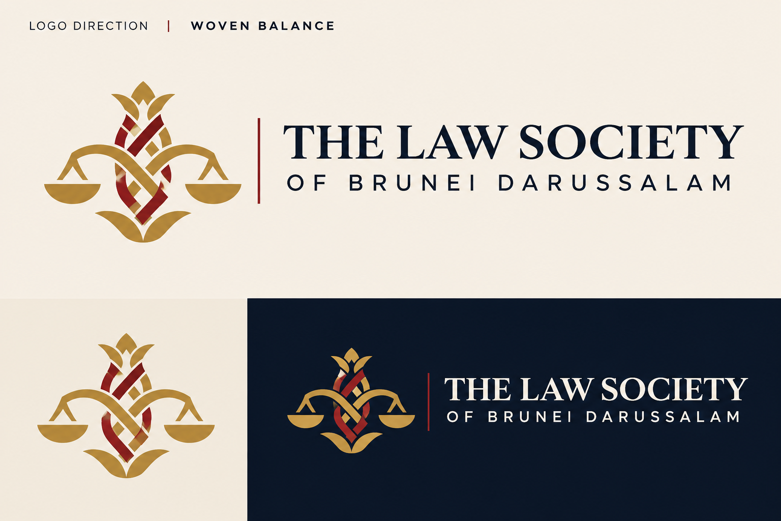
Six visual directions were tested. Independent reviews rejected the pointed-arch monogram as generic and religiously ambiguous, and found the woven route strategically interesting but too complex. The first continuity board preserved the right equity but still read as a trophy. The refined Equal Measure route scored highest for recognition, restraint, small-size behaviour and a usable system.
| Direction | Decision | Reason |
|---|---|---|
| Equal Measure | Recommended | Retains balance and gold equity; open construction; strongest one-colour and small-size potential. |
| One Joint | Secondary concept | Strong local craft potential, but the beam curved and the weave needs documented provenance before it can carry the primary identity. |
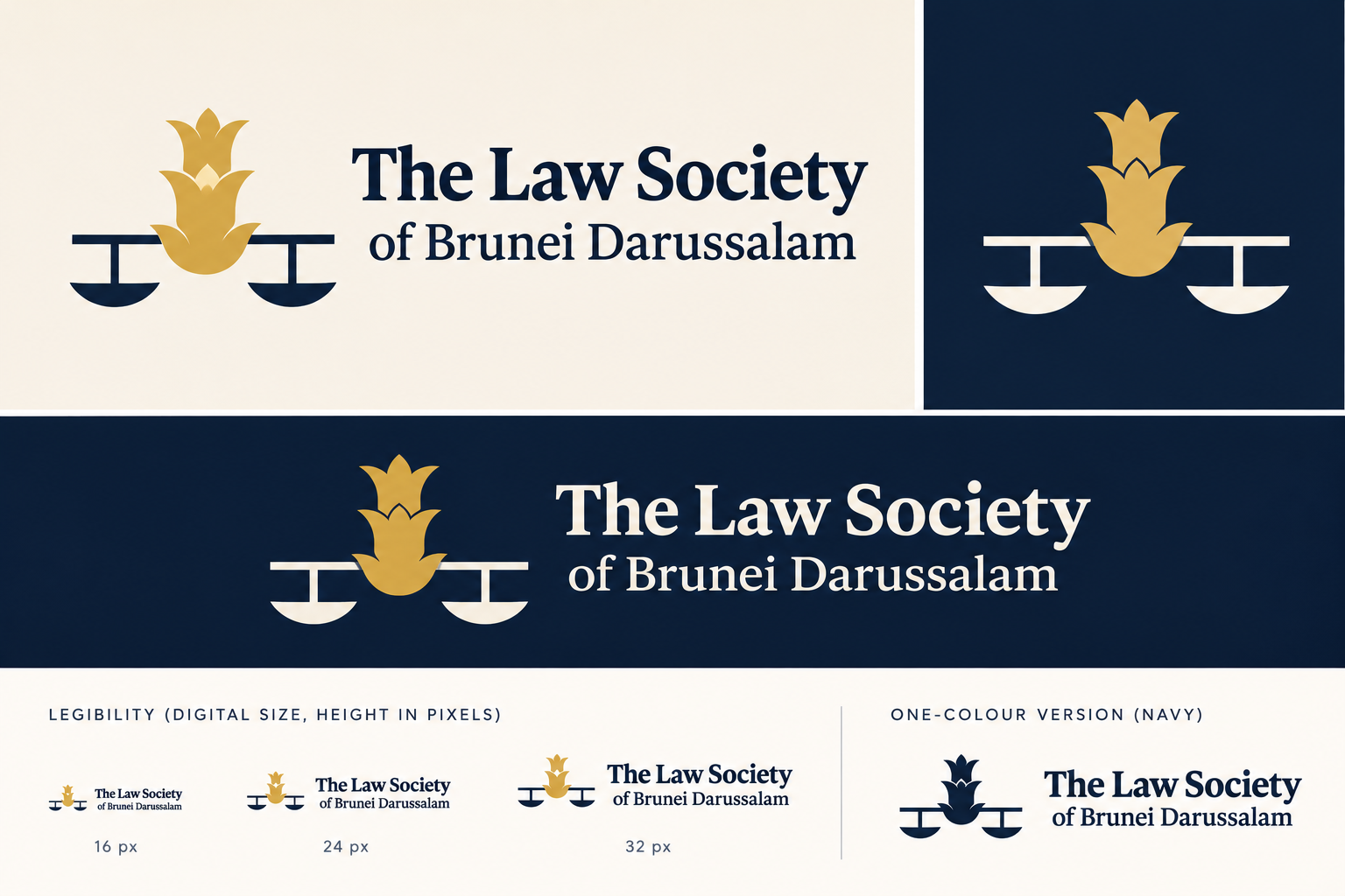
| Wordmark and Spark | Digital-led alternative | Excellent editorial restraint, but the long jurisdiction name carries too much of the recognition burden. |
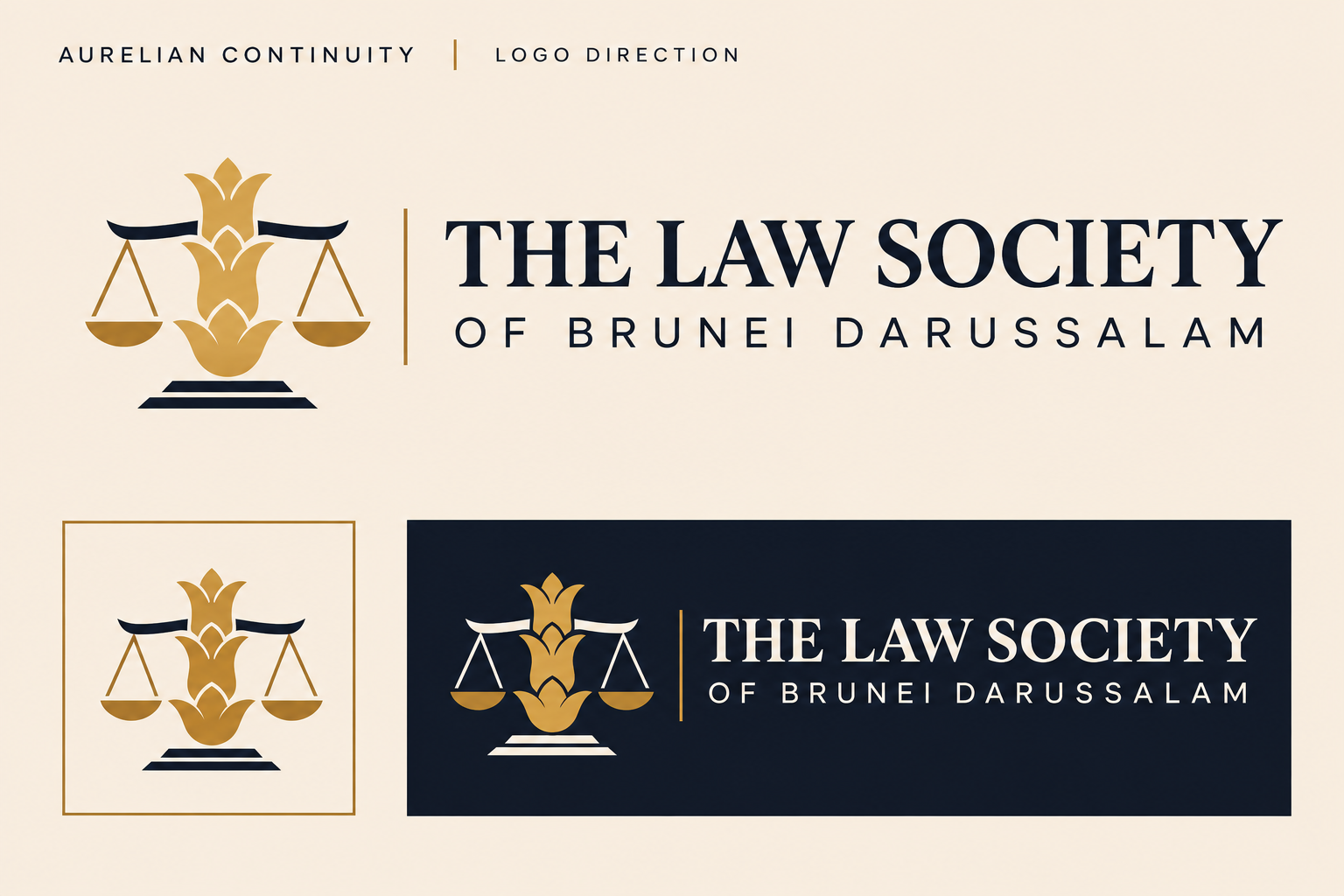
| Aurelian Continuity | Superseded | Right inheritance, but ornamental detail, plinth and luxury typography did not meet the modernisation brief. |
| Woven Balance | Rejected as primary | Idea worth preserving as a possible secondary pattern; unusable as drawn because of complexity and unsupported cultural specificity. |
| Chamber Monogram | Rejected | Arch reads as mosque-adjacent and monogram lacks a legal or public-service idea. |
Verified source trail
- Law Society of Brunei Darussalam — About Us · institutional role and mission
- Legal Profession (Law Society of Brunei Darussalam) Order · statutory purposes
- Information Department — About Brunei · language, religion and national context
- Brunei in Brief · national flag, crest and cultural context
- Brunei Tourism — Flora · Simpur as the national flower
This guide is a design proposal prepared by Digital Sage for client review. It is not a legal opinion, cultural clearance, trademark search or authority to publish national or royal symbols. The current public preview retains the existing Society mark until replacement is approved.